Looking to start a new chapter, Sarah Charlesworth relished putting her own stamp on a period farmhouse
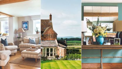
After more than 30 years of farming life in Cheshire, Sarah and her husband David Charlesworth, a semi-retired farmer, were preparing to hand over the reins to their sons, Tom and Sam. Stepping back meant also vacating the substantial farmhouse that had been their home since they were married.
‘Apart from my parent’s house, it was the only place I’d ever lived, so moving was quite an adjustment for both of us,’ says Sarah. ‘We’d loved its high ceilings and big, bright rooms, and so we wanted a spacious, open-plan feel in our new home, too.’
Sarah and David were keen to stay close to their sons. There were several local cottages on the market, but none had the proportions that they were after. However, one option caught Sarah’s eye – a 200-year-old, brick-built farmhouse with land and outbuildings.
Sponsored LinksSon of a Trading Millionaire Gets a “Financial Intervention”VisionaryProfit
(Image credit: Charlesworth/Colin Poole)

New windows on both sides allow light to flood in to the hallway
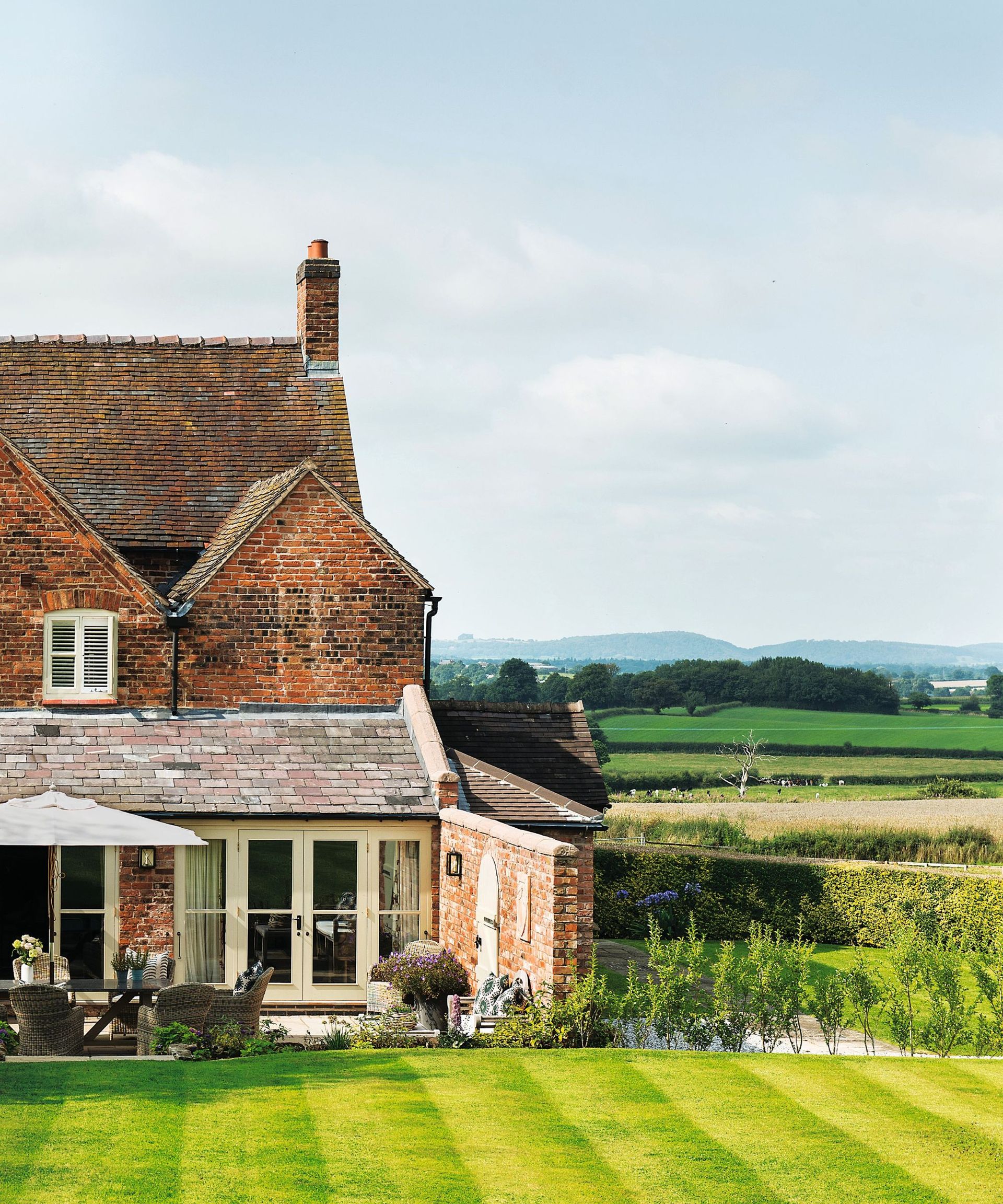
‘This house had a lovely, calm feel, and although it was a bit tired inside, we could see there was no major building work needed to make it ours,’ says Sarah. ‘We loved the elevated position and uninterrupted views of the countryside. Riding is a big part of my life and there was space for my two horses, too.’
RECOMMENDED VIDEOS FOR YOU…0 seconds of 28 secondsVolume 0% PLAY SOUND
For the next three years, while Sarah and David gradually wound down their working roles at the farm, their younger son, Sam, and his wife Annie lived in the newly bought house. During that time, the two bedrooms and shower room on the top floor were remodeled into a comfortable guest suite. ‘That was the biggest structural change we made,’ says Sarah. ‘Sam and Annie weren’t using that floor so it was nice to get the work completed in advance.’
Having had plenty of time to make plans before moving in, Sarah hit the ground running with further changes and updates when she and David finally took possession of the house. ‘I’ve always been interested in interiors and I love looking at magazines, and browsing online,’ she says. ‘I’d say “modern country” best describes my style, and I wanted to go with the feel of the house, rather than try to impose a look that didn’t sit quite comfortably.’

An antique lambing chair adds character to this area linking the snug and dining room

The practical island has an oak top and a neat corner breakfast bar
She revised the layout, turning the dining area of the kitchen into a snug room, with comfy sofas around the fire. The adjoining study then became a more formal dining room. To enhance the open-plan feel, a doorway was added from the new dining room into the living room, creating a circular flow around the ground floor. Light-boosting glass doors replaced some windows and the tired décor was refreshed with a smart, neutral palette. Sarah liked the existing green-painted wood kitchen and it was in reasonable condition, but after a while, she decided to replace it, choosing neat, classic cabinets in a fresh, off-white shade.
‘I loved the brickwork, the old timbers and the cream Aga, but I found the kitchen layout wasn’t ideal, and the island was much too large,’ she says. ‘The whole room feels more harmonious, now.’

Inspired by the existing cream-coloured Aga, Sarah chose off-white for the cabinets and walls for a seamless effect
(Image credit: Charlesworth/Colin Poole)

Furniture that Sarah and David brought from their previous home was a good fit for the snug, and its neutral colours work well with the adjoining kitchen

A large console table creates a focal point, while the foxed mirror above gives a contemporary twist
Downsizing meant Sarah and David had to be selective about what they brought from their old house. Despite moving only a portion of their original furniture and possessions, Sarah discovered that they were short of storage in the new property, especially upstairs, where the quaint bedrooms did not lend themselves to large wardrobes. She created a small dressing area in the main bedroom, but more was needed. ‘The only option was to build wardrobes on the landing outside our bedroom,’ she says. ‘It works well, but for me it was a bit of a compromise, as the landing was such a pretty space.’

Textural fabrics lift tranquil cream and taupe tones, with the bed positioned to take advantage of the views
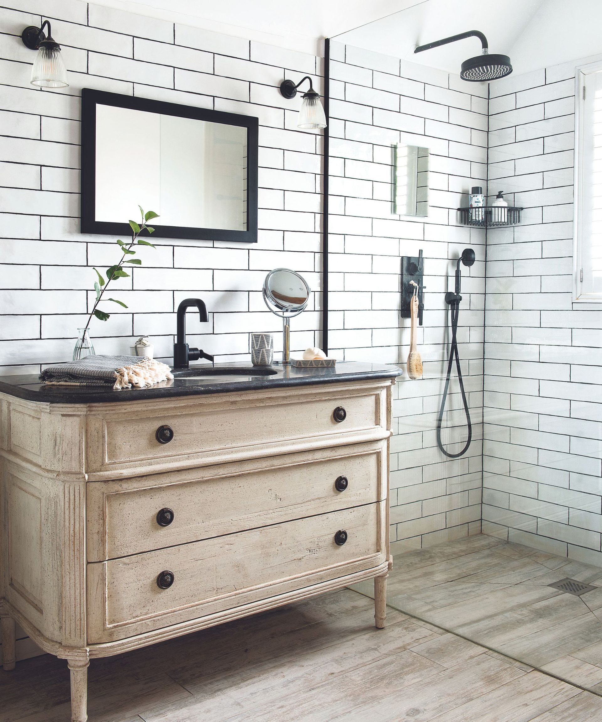
A black-and-cream theme with wood-effect floor tiles creates a crisp feel
Their home now combines heirlooms and treasured items with brand-new buys, while existing chairs and sofas were reupholstered. ‘We’d had some of our things for decades so it was refreshing to clear everything out,’ says Sarah. ‘We’ve added extra pieces recently, and only kept what we loved and what we knew would work here.’
Leaving their previous home certainly was a milestone for Sarah and David, but the experience has been hugely rewarding. ‘I feel that I’ve had the chance to start more or less from scratch, and really make our new home ours,’ says Sarah. ‘It’s been such a positive process and I’ve loved every minute.’

Sarah placed the bed in front of the brick chimney to draw attention to it

‘We loved the elevated position and uninterrupted views,’ says Sarah, ‘plus there is space for my two horses, too’


