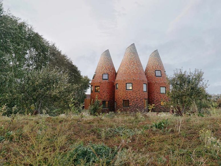
Bumpers Oast is a unique house that shows off its past with pride and is contemporary inside
Standing tall in a former apple orchard amid the beautiful landscape of Kent is a reimagining of the traditional oast house by Studio Acme. The contemporary dwelling draws closely on vernacular oast houses and their coned roofs that were used for drying hops as part of the beer-brewing process.
The proportions of the tower roundels are based on traditional oast geometries, but stand slightly apart from one another; creating views inwards and outwards. Each of the ‘oasts’ contain the more private functions of a home such as bedrooms and bathrooms. The towers between them form a triple-height central space that opens out to the orchard and forms the heart of the house.
The building has a finely-layered transition from open to private. The oasts form open pockets of communal space on the ground floor, shared spaces on the first floor, and secluded treehouse-like retreats on the second floor. Each of the bedroom spaces are located in a roof cone and arranged over two levels. In the children’s rooms, this creates a play space on the lower level that can later be adapted for study, while the master bedroom is designed with a walk-in wardrobe and en-suite bathroom. Helical stairs with curved ply handrails lead into the upper conical sleeping spaces. All the window openings have reveals formed by the walls folding into them, which increases the light refraction coming into the rooms. The curvatures of each room have necessitated the use of finishes able to deal with that. Plywood has been used extensively as it is easy to curve, while in the bathrooms, mosaic tiles and microcement have been used to accommodate the geometry.
Traditional oast houses are brick turrets with shingle-clad timber roof cones. In order to create a very low energy house, it was decided to construct the entire building as a highly-insulated timber structure. The building is also designed to passive-house standards of air-tightness, with the oast cones used to encourage slow air movement and purge ventilation from high level openings during the summer.
2of 7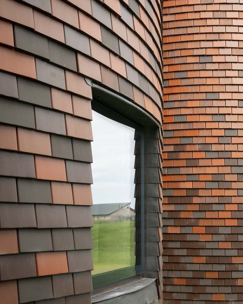
The house is clad with traditional shingle tiles
3of 7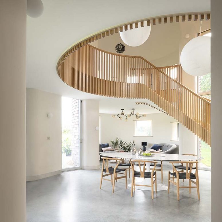
The spaces are light-filled, chic and very welcoming, the color scheme is neutral, with some muted touches and pastels
4of 7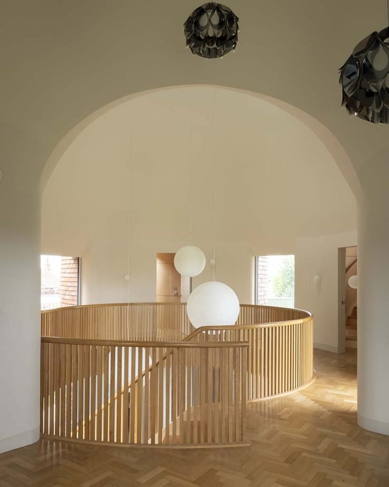
On the first floor, a double height living room is framed by the arched geometry of the intersection of two cones
5of 7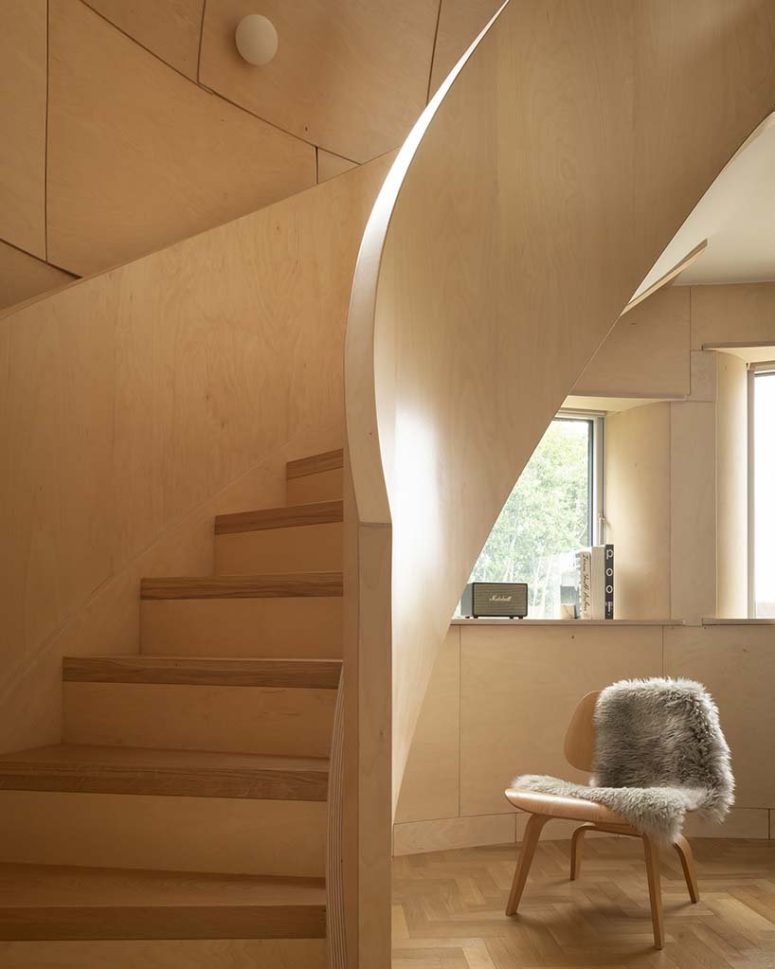
There’s much plywood in decor, it was easy to bend and it makes the spaces look warm and welcoming
6of 7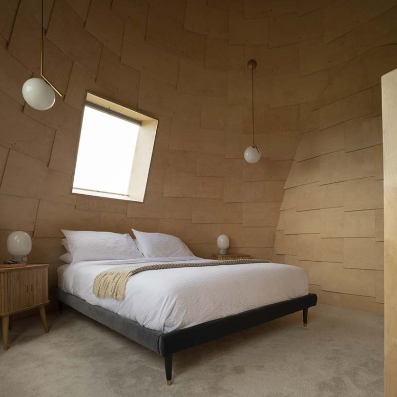
The master bedroom is also covered with bent plywood and the furniture is simple
7of 7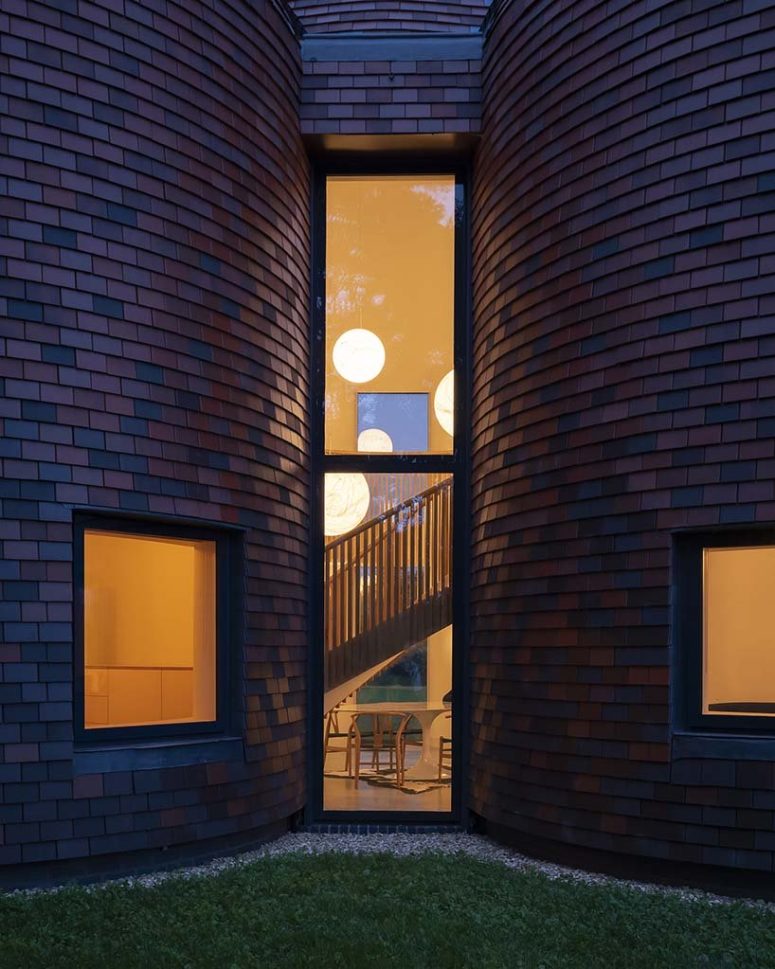
Tall windows fill the spaces with natural light and allow views


